Hey, I recently completed the cover artwork for Hamerex’ new EP, The Last Ride. The EP has been available for about a month now, and is already getting great reviews such as this one: http://sinisterangelsrealm.blogspot.co.uk/2015/04/hamerex-last-ride-ep-2015.html – here’s the first part of my commentary on the process of making the cover.

The EP can be ordered on CD or downloaded from the band’s Bandcamp page: http://hamerex.bandcamp.com/album/the-last-ride
This is a new method of communicating the ideas and methods behind my work – I get to post more updates which means my blog spends less time gathering dust, and you don’t have to read it all at once, which helps if, like me, you have habit of leaving a hundred tabs unread.
Part 1 (Themes & influences):
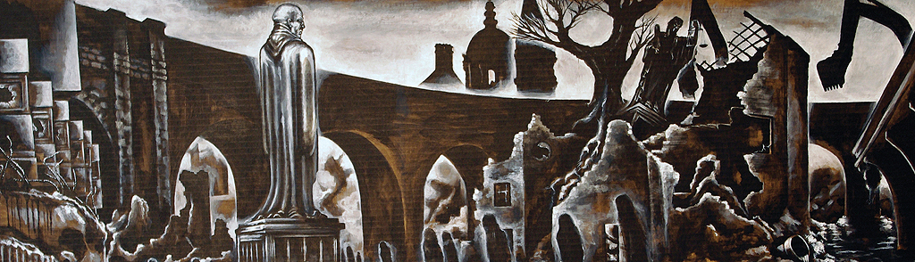
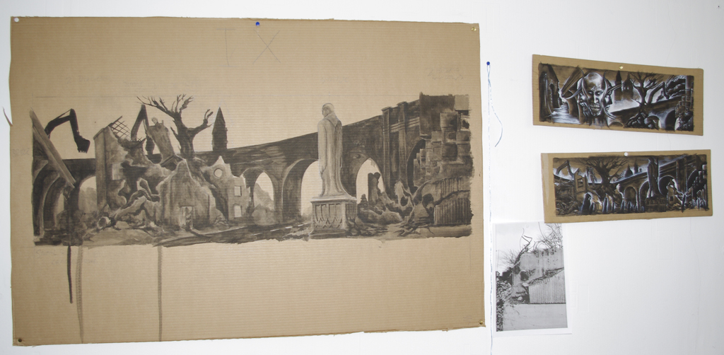
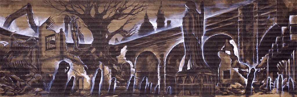
I was given the title of Hamerex’ latest release some time last Autumn. It wasn’t difficult to imagine what the cover art should look like – the EP had a strong ‘apocalyptic’ theme, with song titles and lyrics all referencing mass destruction and the end of the world – the cover had to be a scene which reflected chaos, terror and doom. I went through a few sketches of imploding planets and collapsed cities, but since ‘The Last Ride’ is a lyric from the song ‘Ride On Ruin’, there was my concept straight away. Rider. Ruins. Ace.
The biggest influence in musical imagery was undoubtedly the cover of Judas Priest’s Painkiller album – it’s been one of my favourite album covers for many years, and I have the poster flag hanging above my window. I’ve wanted to do something in homage to it for ages, and this was the perfect chance. This shows most clearly in the burning ruins in the background, and the fact that the Rider’s position is similar to the ‘Painkiller’ character, albeit reversed.

Judas Priest – Painkiller (1990) Illustration by Mark Wilkinson
The other major influence was John Martin’s series of apocalyptic paintings, which are huge canvases featuring massive storms, earthquakes and Biblical judgements destroying populations and civilisations on a grand scale – an ideal fit for an apocalyptic-themed record.

John Martin – The Destruction of Sodom and Gomorrah (1852)
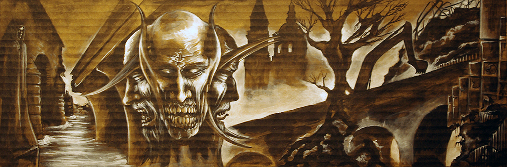
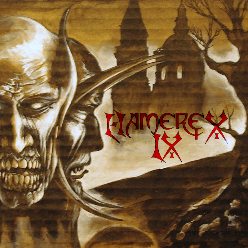
I wanted to update the John Martin feel by giving the ruins a distinctly modern look – the left edge is framed by a huge collapsed building with a metal skeletal structure, and the horse rides across a metallic girder-like structure above tangled steel reinforcing rods. This is partly a carry-over from the last Hamerex album cover, 2013’s ‘IX’ – which also features a ruined cityscape with a few visible modern features such as shattered glass, reinforcing rods and sewage pipes. The idea is that these infernal environments aren’t a medieval fantasy as in one of Heironymous Bosch’s Hell scenes, but an echo of the world we live in. In that sense, The Last Ride is less the Great Fire of London, 1666, more the Great Fire of Leeds, 2015.
It also looks a bit like a Warhammer Chaos Knight, with its massive horns and flowing cloak. But don’t tell anyone I said that. That’s not cool.
Part 2 coming soon!
Hamerex official website: http://www.hamerex.com/
Hamerex on Facebook: http://www.facebook.com/hamerex/