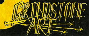
I’ve taken the best bits of my last set of logo designs and refined them considerably, so I now have a halfway-decent logo for putting on pocket clutter. Here are the latest designs, and the 2-colour vector logo I’ll be using for publicity material for the time being.
1:
A development of the first painted logo, with similar block lettering and the blade below the ‘G’, and a few suitably sharp bits such as the pointed descenders on the ‘R’s and ‘A’. The curving lettering is slanted at roughly the same angle as the first logo, and seems just as dynamic, while the curves make it more consistent with the large grinding wheel emblem. The upper spark is precisely horizontal so acts as an underlining for the wording.
I’m concerned that the ‘GRI’ is a little hard to make out as it could get visually lost in the wheel, especially at a distance but that’s a fairly minor concern, which I will address later, perhaps by adding a narrow border around those letters.
I’ll be vectorising and using this logo until I have time to revise it thoroughly, as I need to get material printed soon.
2:
A similar composition to 1, but with freehand-drawn lettering and more spiny serifs and ornamentation. This has a sort of Hammer Horror look – I’d expect to see this pop up to an over-dramatic discordand violin sound.
The lettering looks a bit crammed, especially around the ‘ND/AR’ which makes it difficult to read and visually confusing so I’d stay away from this kind of lettering unless I was doing a full-on Black Metal style logo (whcih I enjoy doing a lot, but it’s not suitable for illustrators’ publicity material). I’m tempted to do a BM logo for GsA at some point, but it isn’t a priority.
3:
Another horror movie-style logo with a bit more attention paid to the lettering. I’m quite pleased with the lettering style here, but the long descenders detract from the dynamic effect I want. This sort of lettering would be worth using elsewhere but I don’t think it works for GsA.
Vector logo:
So here’s the vectorised copy of the curving block logo. There are a few issues to iron out, such as a few dents & bumps in the vertical lettering and the narrow border around ‘GRI’, but this is serviceable enough for use on promotional material for now. I’d better get to work making some promo-prop then, eh?


