Reight. if I’m going to do Grindstone Art properly, I’ll need publicity material – contact cards, flyers/leaflets, web banners and all sorts of fancy stuff. With that in mind, I’ve been working for much of the last week on a logo design I can adapt for any medium. Here are my finished and painted draft logos so far. I’ll base the final one on a mixture of my favourite bits of these. They’re all 150 x 60mm, acrylic paint (and black acrylic ink in some cases) on 150gsm paper.
1:
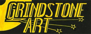
The first painted draft looks pretty serviceable but not perfect. I quite like the blade on the G descender, and the placement seems to work quite well. Composition-wise, it’d make a good header for a card or flyer.
I’d been experimenting with symbolic spark effects (which I will definitely use in my final design) but I think those star-shapes look a bit naff, and placed too close to the E & bottom line. The top spark-line could work to underline the title, but the slight upward angle constrains the eye a bit. I might keep this basic composition, but I’ll alter the sparks.
The worst part is that it reminds me a lot of another logo – I couldn’t remember the name at first but figured it out when I’d nearly finished: the bold capital letters and tilted text are part of the Bridgestone tyres logo, which makes me label this the Bridgestone Art logo. I don’t want my logo to remind people of tyre companies, so that needs to change. The tricky part is changing it without losing some of the dynamic effect this logo has , and which I’m quite pleased with overall.
2:
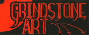
This was an attempt to develop some of the ideas in #1, using the same basic composition & lettering style but without the tilt. I added a hooked serif to the bottom of most of the letters, which was intended to add an element of rhythm but actually just ends up looking like dangling bananas. I’m just glad I used orange for this one rather than yellow. One to avoid in the final design.
The vertical block lettering has little of the urgent quality of #1, which goes against the idea of a motif based on movement, so I’ll have to find another way still of showing the dynamism I want from my logo.
It uses solid, spoke-like sparks instead of the cartoonish stars of #1, these look much better so I’ll use these in the final design. I took some time to plot the curved light-trail but it seems to just drag the eye down below the banner – a frustrating distraction from the design.
The orange colouring seems too dark on the blakc background, so if I use orange on the final design it should just be to add some extra punch to a larger area, rather than a dominant colour (it just isn’t dominant enough). I’d need to be careful though, too much yellow/red/orange on black will always remind me of the Games Workshop logo, which for the sake of my own health, I want to avoid.
3:
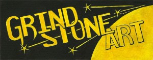
I tried reversing the composition here, but it leads the eye off in totally the wrong direction. If you’re used to reading left to right, text angled to the left just gets confusing.
The overlapping letters might save a bit of space but the create too much separation between the words (‘Grindstone’ should be one word!) .
Having the sparks surrounding the lettering, rather than underlining it, makes it look far too spangly & glam for my tastes, whereas it should have a harshness of sharpening a blade. It isn’t about the sparkles, it’s about heat, noise and Metal. That mustn’t be forgotten. This logo can.
4:
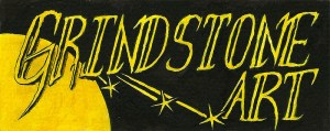
The lettering here was done free-hand with a steel-nibbed pen rather than plotting it with a ruler & protractor first. I did measure out the basic tilt angle & the baseline/cap-height, but they have too little distance to really make a visual impact. This has some of the dynamism of #1 but having ‘Art’ at the right side makes it seem extraneous, too far removed from the grindstone motif to be part of the core image.
I do rather like the hand-drawn look though, I might condiser keeping that. I’ll have another go at a hand-drawn GA logo before I settle on a final design. This lettering looks too thin and is easily overpowered by the sun-like grindstone, so I’d make it thicker & bolder than here.
So, for the final logo:
Grindstone on the top left corner. Full moon, not setting sun.
Sparks, not sparkles, stars or spangles.
Yellow on black. Possible sparing white or orange.
Bold text.
Dynamic angles, but not to the extent of resembling tyre companies.
Metal, not fruit.
###
Coming soon: The final design for ‘IX’, which has now gone to print, a possible project with another band who got in touch with me t’other day, some early sketches for GA logos and the final logo development and design.


