
‘The Pit and the Pendulum’ (2017-2020), based on the short story ‘The Pit and the Pendulum’ (1842-43).
This illustration wasn’t one of my favourites early on. I felt the walls and sky felt a bit too plain, and wasn’t sure if the focal points at the top and bottom were detailed enough. Getting the moon and pendulum in the right position was tricky and the line drawing has little movement. It looked too static.
When painting the piece, I made sure everything heightened the tension and drama to a vision of pure mortal terror. This is a life-and-death situation, and the latter should be inevitable. You should be able to feel the flames at your sides and hear the creaking swoosh of the killer blade. I emphasised the contrast wherever I could, using layers of hot reds and oranges at the outside against a cool stone and night sky, back to hot in the centre. The stars are salvation. The blade is between the viewer and any hope.
This is, ultimately, all about the perspective. Everything is steeply angled to that one vanishing point at the hand of Time. It took some time to construct all those perspective lines, and longer still to work the highlights on the brickwork and lancet windows so the horizontal edges didn’t detract from the vertical concentration. Father Time (who must not resemble Father Christmas!) and the unfortunate skeletons are a sort of bonus – a reward for the extra effort of looking away from that dreaded scythe.
Someone said to me “I feel like I’m there!” which is hands-down the best complement an illustrator can receive on their work. Father Time can rest easy, I expect.
Acrylic on greyboard, 210 x 297mm.
Daler Rowney FW inks: Black, Indian Yellow, Scarlet, Yellow Ochre
W&N Galeria paint: Titanium White
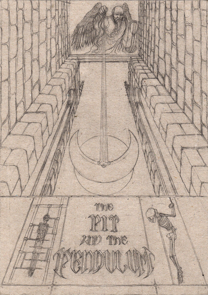
Pencil underdrawing
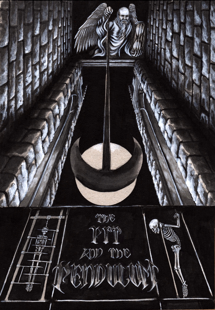
Base layer black ink and white paint
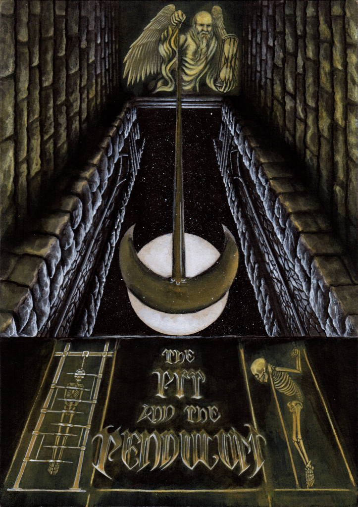
Yellow ochre inkwash and additional white highlights
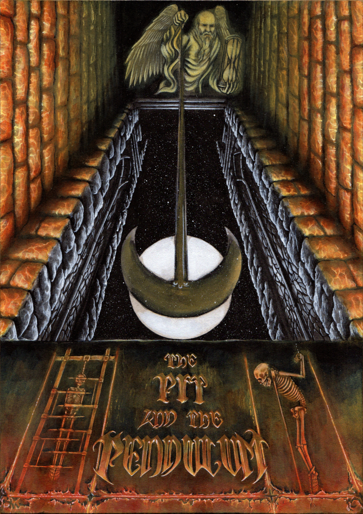
Colour layers – scarlet, yellow ochre with detailed shade and highlights

No-one expects the Spanish Inquisition.
