Hamerex ‘IX’ cover concepts part 2

Current Works in Progress, Hamerex

Here’s my second set of draft images for Hamerex’ forthcoming album, simply titled IX. These are in a different format than the previous images as they’re designed for a much wider layout. It’s quite liberating to work in such a wide landscape format as you can explore detail to the right and left of the central image. It requires a different level of attention to the composition, and doesn’t reward confined perspectives. I’ve played around with perspectives a few times during this project and you can see more of my experimentation as I release more images. The best is still to come πŸ˜‰

Once again, these use the central railway bridge as a linking motif, with some recognisable features from Wakefield’s landscape. Both images are approximately 100 x 300mm (excluding margins) and rendered in black acrylic ink on packing paper.

IX Black Concept 1 1024

IX Black Concept 2 1024

Hamerex: ‘IX’ cover concepts

Current Works in Progress, Hamerex

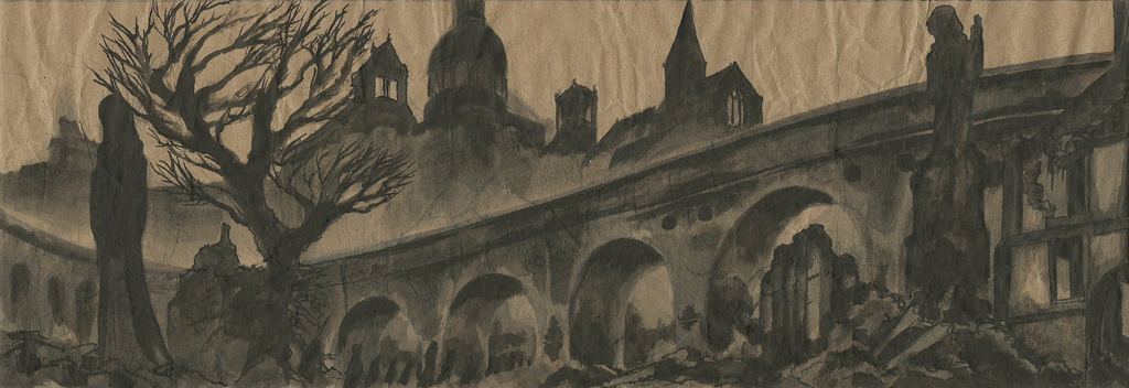
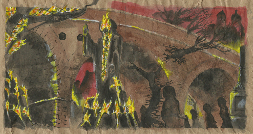
The first colour concept image for Hamerex’ forthcoming album. The basic theme of the cover is Wakefield, West Yorkshire (the band’s home town) as Hell. The album has a recurring influence from Dante’s Inferno, one of my favourite books. I’ve been through Wakefield many times on the train so have mainly seen it from the top of the large rail bridge that cuts through the centre. Looking down from the bridge reminds me of Hell’s Malebolge, a series of concentric rings of vast trenches or canyons in which the shades of sinners march, flee, boil or are trampled for eternity. Hence, I’ve chosen the bridge (viewed from ground level) as a unifying factor throughout the visual development progress. Or, in real-personish, as an image that links all the drafts.

IX Concept Inked 1 Preview

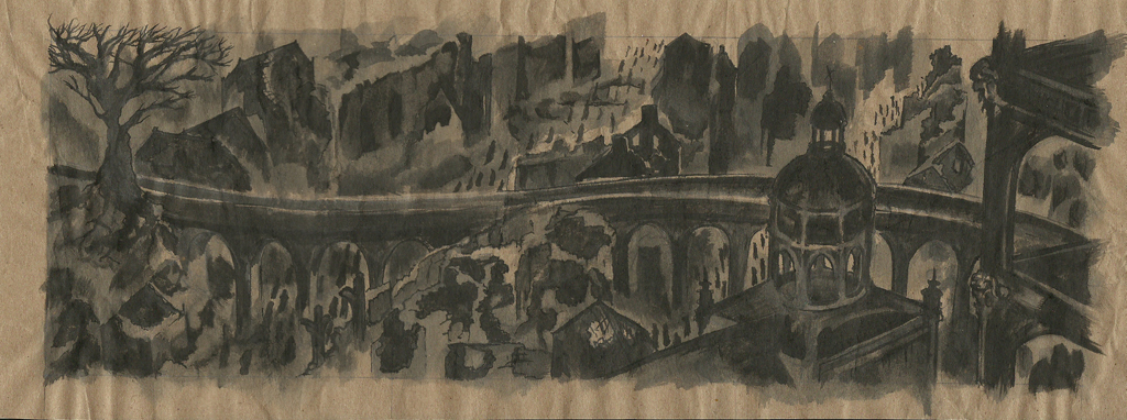
I was never entirely satisfied by this draft, & didn’t think it was necessary to work into the detail of the bridge or the buildings in the background. The emphasis here was mainly on the mini-Balrog-like demons and marching shades.

IX Colour concept 2 1024

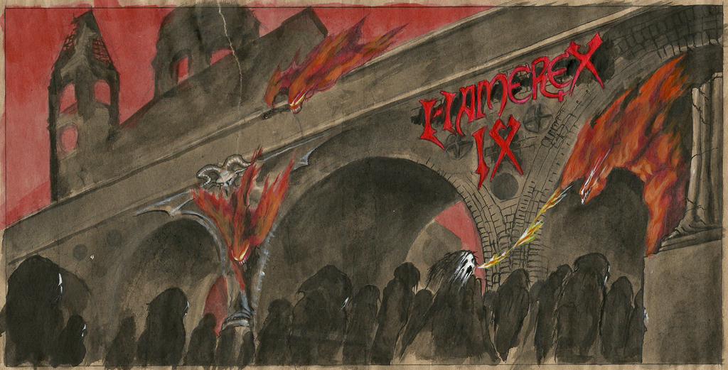
Again, I didn’t think it was necessary to work into the detail of the bridge or the buildings in the background, though this does give more of an impression of the Wakefield skyline that gets much more attention in later drafts (coming soon!). The emphasis here was on the giant three-faced Lucifer who resides in the lake of Cocytus, the centre of Hell.

IX Colour concept 3 1024

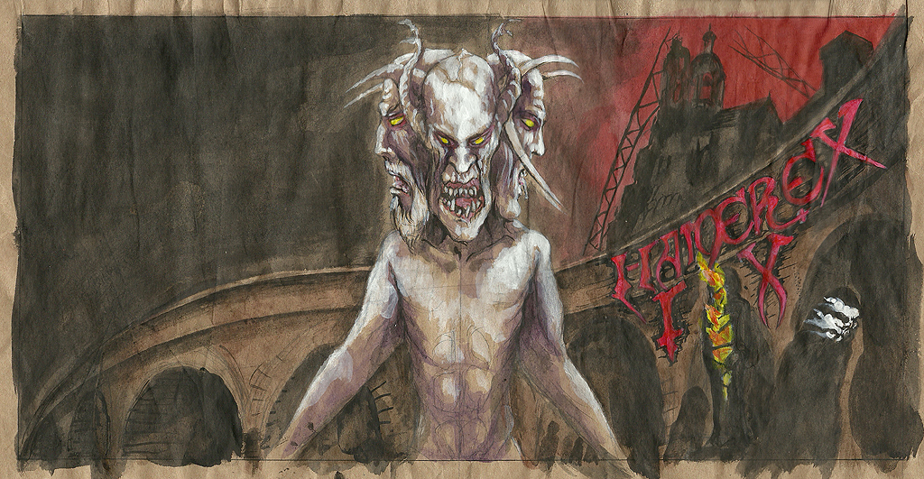
This draft focuses on what would be the reverse-side of the cover, a scene influenced by the Fifth Circle of Hell, the City of Dis, in which the souls of Heretics burn in stone sarcophagi, surrounding the tombs of the leaders.

All images areΒ  rendered in Acrylic ink & paint on packing paper.

A video clip of the recording progress can be viewed here: http://youtu.be/23dfPJyjPL0

A live performance of the song ‘Inferno’ from the forthcoming album can be viewed here: http://youtu.be/l30-xUCL8xE

Hamerex’ website: http://www.hamerex.com/

These images can also be viewed at Grindtone Art’s deviantART page.

Doris Banham Benefit Flyer

General, Posters

Turns out the Grindstone isn’t just for Metal, it has room for a bit of ‘punk, acoustic & spoken word’ too.A friend asked me to design a flyer for this gig, a fundraiser for Doris Banham Dog Rescue. I kept it simple for a number of reasons, mainly time constraints and to save on printer ink.

EDIT: Venue changed to THE REDHOUSE, 168 Solly Street, Sheffield, S1 4BB

Doris Banham Flyer 800px

I first made some basic sketches to get the idea onto paper. I’ll admit I didn’t think too hard about the imagery, it’s a guy with a dog where his mohawk would be [incidentally, I decided whether to do a male or female character by flipping a coin. You may note a certain androgyny-bias to my work].

Doris Banham Sketches Web

The drawing was first mapped out in pencil:

Doris Banham pencils preview

Then finished using black acrylic ink & steel-nibbed pen, with brushes for the larger black areas such as the mic stand.

Doris Banham Inks Web

I then used InDesign to add & edit the flyer text. I tried using a bold sans-serif font (OldSansBlack) with a few modifications to make it as clear as possible, but decided it looked a bit too harsh & that a light-hearted serif font was more appropriate, so I went for NuevaSTD.

I’ll be at the gig on Saturday, it looks fun.

Printable .pdf copies of the flyer are available here:

Single A4 sheet: Doris Banham Flyer A4

4 A6 flyers on one A4 sheet: Doris Banham Flyer A6 x4 +PC

Hamerex – Into War (2009)

Hamerex, Past Works

Here’s my first update on the old stuff I did before Grindstone Art was an actual thing: Hamerex’ first EP, ‘Into War,’ released in 2009. I was very excited about this as it was my first commissioned record cover. I used this in my portfolio when I was applying to Lincoln. I’ll write a little more about the process later, but for now, have a look. I’m still quite pleaed with this a few years on but I certainly learned a lot in the process & there are a few shortcomings that show now I might not have spotted Way Back When.

Hear the record at Hamerex’ Bandcamp page HERE.

Cover illustration for Hamerex' Into War EP


Front & rear of Hamerex' Into War EP inlay booklet


Rear cover with tracklist for Hamerex' Into War EP

CD top print for Hamerex' Into War EP.

More later, Metalhorrors!

The Grindstone is for Metal

General

Hello Grinders,

Grindstone Art is a one-person design studio in the darkest recesses of Sheffield’s industrial district, amongst factories, workshops & machines. This city is a perfect breeding ground for the alienation, darkness & noise which drive us to scream in the night, the fuel for Metal drips from every leaking pipe & overflowing storm drain. Chain-link, barbed wire & spiked fence fortresses are the whole world in this Metal prison. It is little wonder the mind seeks solace in violent sounds. In this solace, we find Grindstone Art.

###

I’ve been illustrating for many years now & will be gradually updating this blog with old stuff as well as adding new work under the Grindstone Art label. I have a current project for Wakefield band Hamerex & will be seeking new projects soon.

I work in a range of styles & love experimenting with methods, processes & materials. I regularly combine digital & traditional media, using inks, paints, photography & sculpture to create unique images.

I’ll occasionally review pieces of album or music-related art that catch my eye, & comment on things like the compositions, colour schemes, typography & other elements, so I can develop my own eye for these & so you get some idea how I think. I have a lot of old favourites so I’ll never be short of material. There are some fantastic artists popping up even now, when album art seems to feel obsolete too often.

I have a firm ethical policy which I will expand upon later; suffice to say there is enough misery & suffering in the world for me to want to compound it any further. There is plenty to explore in Metal without glorifying abuse, supremacism & misogyny.

Enough for now.

Until next time.