KJ004 Shoemaking part 3

Uncategorized

Blimey, it’s been a while! I’ve been working on and off on the Keira James Mark 4 shoes for nearly 6 months now, due to available materials, tools, confidence in my own skills and constant experimentation and refinement. It’s a turnaround time that will need some improvement if I’m to start doing these for other people. On the plus side, they’re going well, so I have plenty to report.

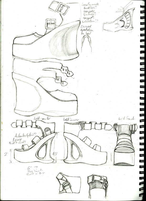
I realise I never posted the original design for these – so here is the full-scale plan I have been following:

KJ004 Design 1024

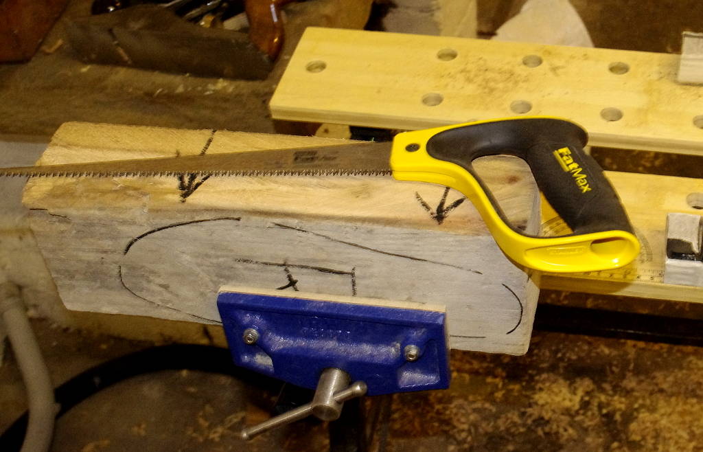
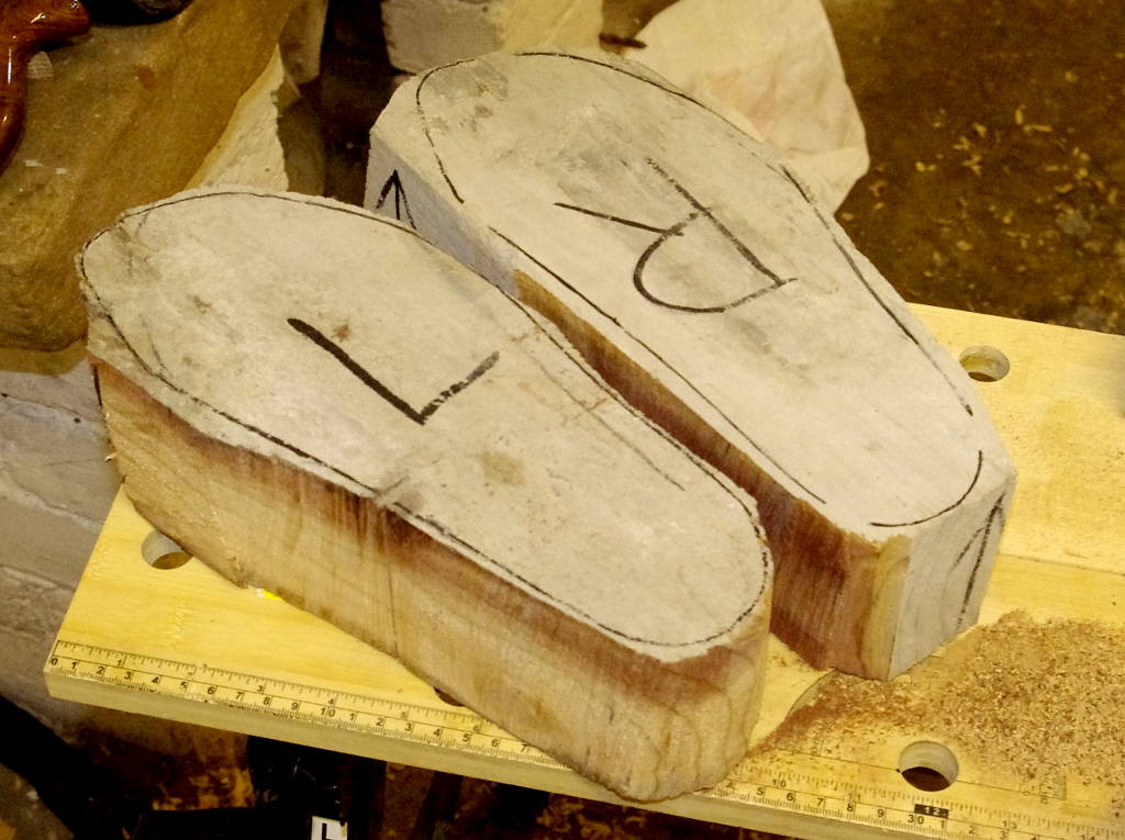
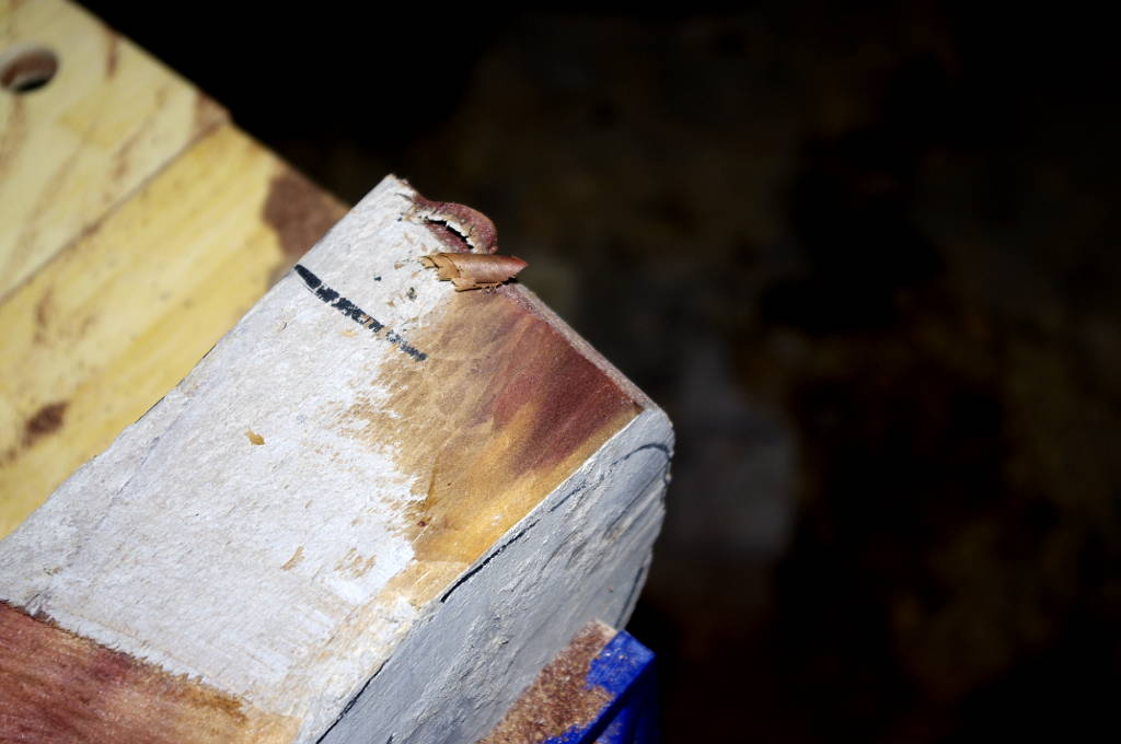
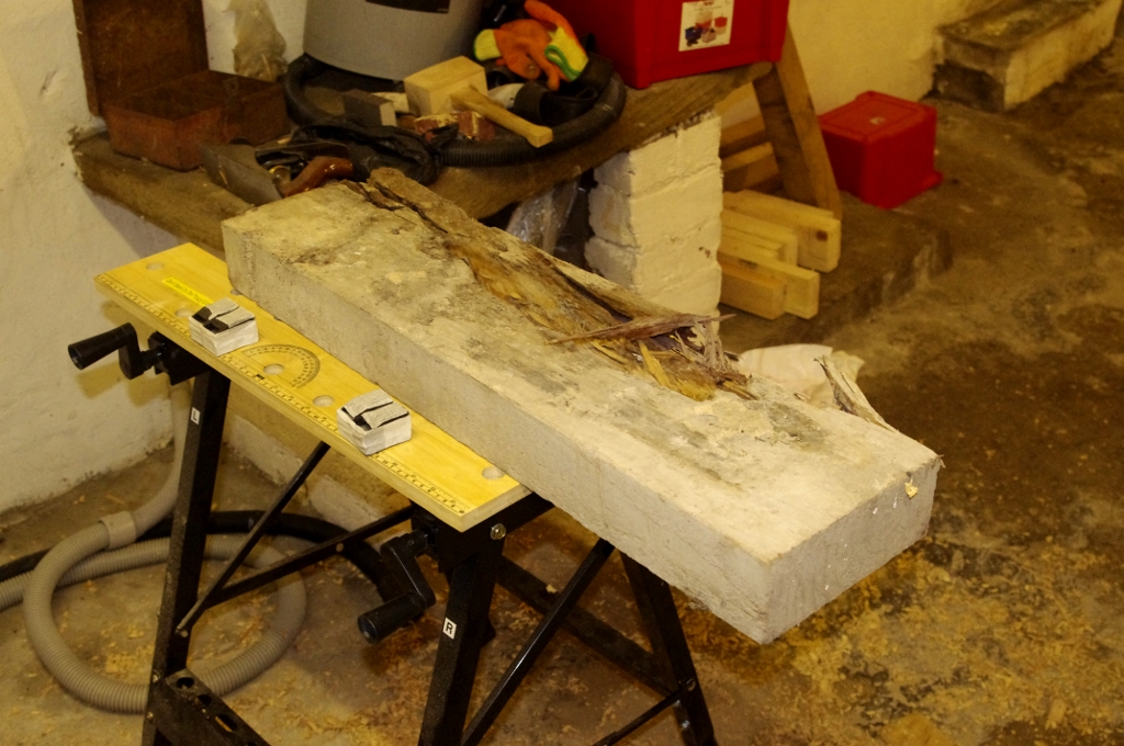
I have made a few modifications to the heel area but on the whole the desogn has stayed consistent throughout the process. I used tracing paper to transfer the shapes from the design to the wood, repeating the process when the tool work rubbed or cut away the markings. I used a range of chisels and gouges to cut the grooves all around the heel, switching between them regularly to help keep the grooves consistent. Here’s hwo they looked when I’d finished chiselling out the grooves, before starting on the carved vine details:

KJ004 Side Carved 1024

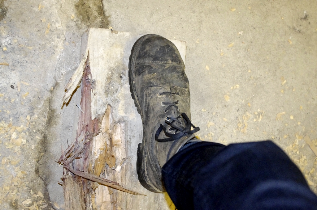
I used tracing paper again to transfer the vine pattern from the drawing. The need to flatten the paper inth the curved groove means the shape is slightly distorted as the drawing is narrower when viewed head-on. This isn’t a big deal as the carving process can compensate for it.

The vine tracings themselves were carved with a range of fine chisels and scalpels, occasionally using a curved needle file to smooth some of the groove edges. They’re somewhat wider than the narrow tracing in the design, about 6mm in most cases, as the softness and age of the wood meant it doesn’t hold its shape when carved. I am pleased with how the carving has turned out in spite of that.

Here’s a late-stage WIP of the vine carvings:

KJ 004 Side Vines 1024

I’ve done more work on the soles since then, the woodcarving stage is almost complete, and I’m in the process of carving the footbed to suit the shape of my feet. After that they’ll be filled, sanded and sealed ready for painting.

I haven’t said much about the upper shoe components so far. It takes a while to work out the measurements and cut the patterns and it’s hard to find much to write about there. Still, I worked it out and cut the raw fabric to shape. The black fabric is a thick, strong cloth I originally bought to make a banner about 11 years ago, and has been more or less idle for that long. I wanted a much finer finish on this pair than on my previous efforts, so no scrap car seat fabric this time (though I will be using the thick seat padding to make the insoles later).

The white lining is from the same quilt cover I’ve been using since I started shoemaking, as it’s comfortable and plentiful.

KJ004 Ankle Straps Raw 1024

Here’s the upper set as it stands at the moment – the sewing is complete on the outer ankles and D-ring fastenings, but needs finishing on the long straps and bottom hems. I had originally planned to tack the uppers through just the outer layer of fabric, which is why the bottom hems haven’t been stitched so far, but it would make more sense to use both layers of fabric for added strength.

KJ004 Straps Sewn 1024

And for pure vanity, here’s a close-up of the stitched detail on the rings:

KJ004 KJ Logo

I’m almost at the end of these parts of the project – once these are done, I’ll be making the insoles, cutting and attaching the tread and finally affixing the uppers to the sole. Then I can make my long-awaited Shoe Debut in the glamorous Yorkshire rain. I’d better make sure they’re properly sealed and waterproofed.

James Hetfield – Hunting Trophy

Uncategorized

“Thankyou Mommy!”

“My pleasure honey. Remember, we’re doing this to save Metal!”


Hetfield Trophy 1024
I drew this image in response to the news that Metallica’s James Hetfield would be narrating a TV show called ‘The Hunt’, about a party of big game hunters going to Alaska to, well, kill bears. Funnily enough, I’m not dead keen on the idea. I knew Hetfield was into some bloody weird stuff long ago, but something so blatantly, publicly celebrating the murder of wildlife was a step too far. So here are my thoughts, in simple visual language.

This is obviously the work of someone who loves Metallica’s music (while it was still good 😛 ) as you can tell from the t-shirts and M-shaped plaque. There’s a fair amount of cognitive dissonance involved in condemning someone whose work [a long time ago] you greatly respect.

I recommend listening to Megadeth’s Countdown to Extinction as backing music. It seems highly appropriate. Not that I agree with Mustaine on everything (or, for that matter, most things), but it has a particularly fitting theme.

I am in the process of drafting an ethical policy for Grindstone Art. I have very strong views on many issues, and animal cruelty is one of them. I will never depict animal abuse, exploitation or cruelty except to explicitly condemn such acts.

Black acrylic ink, white acrylic paint on paper, 295 x 207mm including margins.

Original and prints for sale, email if interested . 25% of proceeds to a worthwhile anti-hunting cause.

KJ004 Shoemaking Part 2

Uncategorized

I’ve been back down the cellar again over the last few days and made a start on chiselling the wood into shape. First though, I drew the outline of my foot onto graph paper using a flat pencil, with my heel propped as close to 5cm as I could get it, and adjusted it to produce a suitably elegant shoe outline shape. I traced this out and used a brush and ink to clearly mark the outline on the wooden blocks.

The fine piece of kit in the first picture is a Compass Saw (I’m happy to say I didn’t make up ‘Fatmax’), which has a tapered blade for cutting curves. Unfortunately it becomes really hard to handle properly when cutting through thick pieces like this, so I had to resort to the big handsaw to chop off the bigger pieces around the outside of the shoe shape. This means a bit more chisel work later, but isn’t a big deal.

KJ004 WIP 07-02

This is how they come out after the excess has been sawn off. Somehow, these don’t look ready for a night out just yet. I’ll be saying that for a while, but I’m sure the effort will pay off.

KJ004 WIP 10-02 1

Next I used a 32mm (1 1/4″) chisel to get rid of as much of the scrappy edge as I could, paring it down to the inked outline. As I got to work, I revealed the colour of the wood under all that grey coating. I don’t know what had happened to the wood to stain it in that particular way, but when it was cut cleanly it revealed a really distinctive deep red colour. This only occurs within about 3cm of the edge, which is frustrating – I’d really love the whole shoe to be this colour! Isn’t that pretty?

KJ004 WIP 10-02 3

As well as the beautiful reddish-purple there were some much less appealing darker stains made by moisture leaking into the wood, which I’m not to pleased about. That will affect what I do to finish the surface of the wood, but that’s a problem for later. I may well end up painting them. I do have some off-cuts with that red stain so I might use them to make something else so that gorgeous deep red doesn’t go to waste if the shoes get painted.
That said, carving pieces of the dark-stained areas did produce some quite interesting effects, like this cute little swirl of striped colours:

KJ004 WIP 10-02 2

This was how they looked after I did the first round of chiselling and came back to them today:

KJ004 WIP 12-02 1

And this is how they look now I’ve done all the way around the outside:

KJ004 WIP 12-02 2

I’ll finish off the sheer sides with my new Compass Plane in the next couple of days, but it’d be best to finish that fully after I’ve cut the fore-foot areas.

Disappointingly, this wood seems far too soft to hold any detail, as it tears very easily at the end grain. I may have to content myself with some elegantly-shaped, if not intricately-carved footwear in this case. Oh well, at least I won’t be using up all my good ideas at once. More to come soon 🙂

– K.J.

KJ004 – Handmade Shoes, mark 4

Uncategorized

Hey-y-y, finally, I have gotten round to doing the first post on my Making Nice Things blog 🙂  Welcome to JK Mullett/Keira James’ Art and Craft. There is much more to come.

I’m just starting work on my fourth pair of handmade shoes. At some point, I’ll post images of my first three pairs, but for now I’m going to detail all the steps I go through putting a pair of shoes together. I’ve had a fair bit of experience making shoes since I started about a year ago, but it’s still an entirely experimental process – some things I know well enough to do right first time, others I’ll get wrong and I’ll need to find other ways. There’s no other way to learn.

Right, a month or so ago I picked up this bit of timber from a local builder’s yard. Obviously, this bit of wood is past its prime but I think there’s enough solid, undamaged wood on the left side to make a pair of wooden soles. This is how my shoes start out:

WIP 2014-01-30 Plank

Naturally, I’m far too lazy to mark these rough blocks out properly, so I use a reliable enough method of measuring: I know my feet are smaller than my boots, so bigger than that is big enough:

WIP 2014-01-30 Boot

Next I simply sawed the plank across and along the bigger-than-boot marks, which was fairly quick but hard work. It wa actually the first time I’ve used a large handsaw & I found it a little unweildy, but I’ll have plenty more practice before I can put my works into production. There were a few podially-privileged friends living in the splinters so I had to be a bit careful to get them out of the way. I’ll have to find another use for the off-cuts besides being a spider habitat – perhaps carving them into jewellery, shoe clips or other accessories.

In the next few days I’ll plan out exactly what shape these big blocks will be carved into to turn them into usable, comfortable footwear. Two blocks is a far cry from the sculptured form I have in mind for the finished products, but you have to start somewhere.

WIP 2014-01-30 Sawn

I’m considering a hybrid of these designs: a closed toe cap with the double-D-Ring fastening strap, and my first attempt at hand-carved detailing on the wooden heel and around the toe area. I’ve plenty to go on since I’ve spent bloody ages sketching out designs. I’ll post finished designs up here as they get, y’know, designed.

2012-01-02 Sketches Web

That’s all for now.

– K.J.

New Things, Nov 2013

Uncategorized

Since the IX project finished, I’ve been sorting out promotional bits and web stuff – making cards, banners, avatars and all those things. Here’s a summary of the New Things:

Grindstone Art is now on Twitter: https://twitter.com/GrindstoneArt / @GrindstoneArt

Here’s my new avatar for Twitter & DeviantArt, which I’ll also use when I get round to bothering people on forums and such, with a detail from Hamerex’ Rites of Passage album artwork from 2011.

GSA Twitter Avatar

Here’s a contact card using a variant of the same detail. I call this the Burton Card because I think he looks a lot like legendary grumpy bugger Richard Burton. I’ll get some printed when I can find somewhere that does contact cards on the cheap.

GSA Burton Business Card Web Preview

This is the Twitter background banner featuring a detail from Hamerex’ IX album cover illustration:

Grindstone Art Twitter Banner preview

Last week my friend and fellow Sheffield artist/musician/poet Rowan posted an interview with me on his website about art and music.

“It’s the illustrator’s job to make a visual work which suits the music. The best illustration doesn’t just fit with the music, it adds a new dimension to it. The moods expressed in really beautiful music tend to be extremes of joy or pain, just as in beautiful art. I don’t have a lot of time for the moderate or mundane, and working to, or for, music which explores extreme emotions is an excellent way to bring that out.”

Read the full interview here: http://rowanblaircolver.weebly.com/3/post/2013/11/interview-with-james-mullett.html

Grindstone Art logos (part 2)

Uncategorized

I’ve taken the best bits of my last set of logo designs and refined them considerably, so I now have a halfway-decent logo for putting on pocket clutter. Here are the latest designs, and the 2-colour vector logo I’ll be using for publicity material for the time being.

1:

Aug 2013 Logo 4 800

A development of the first painted logo, with similar block lettering and the blade below the ‘G’, and a few suitably sharp bits such as the pointed descenders on the ‘R’s and ‘A’. The curving lettering is slanted at roughly the same angle as the first logo, and seems just as dynamic, while the curves make it more consistent with the large grinding wheel emblem. The upper spark is precisely horizontal so acts as an underlining for the wording.

I’m concerned that the ‘GRI’ is a little hard to make out as it could get visually lost in the wheel, especially at a distance but that’s a fairly minor concern, which I will address later, perhaps by adding a narrow border around those letters.

I’ll be vectorising and using this logo until I have time to revise it thoroughly, as I need to get material printed soon.

2:

Aug 2013 Logo 5 800

A similar composition to 1, but with freehand-drawn lettering and more spiny serifs and ornamentation. This has a sort of Hammer Horror look – I’d expect to see this pop up to an over-dramatic discordand violin sound.

The lettering looks a bit crammed, especially around the ‘ND/AR’ which makes it difficult to read and visually confusing so I’d stay away from this kind of lettering unless I was doing a full-on Black Metal style logo (whcih I enjoy doing a lot, but it’s not suitable for illustrators’ publicity material). I’m tempted to do a BM logo for GsA at some point, but it isn’t a priority.

3:

Aug 2013 Logo 6 800

Another horror movie-style logo with a bit more attention paid to the lettering. I’m quite pleased with the lettering style here, but the long descenders detract from the dynamic effect I want. This sort of lettering would be worth using elsewhere but I don’t think it works for GsA.

Vector logo:

Final Logo Aug 2013

So here’s the vectorised copy of the curving block logo. There are a few issues to iron out, such as a few dents & bumps in the vertical lettering and the narrow border around ‘GRI’, but this is serviceable enough for use on promotional material for now. I’d better get to work making some promo-prop then, eh?